Portfolio
Featured Projects
Client: Walgreens
An effective UX case study for a Walgreens client project needs to balance standard retail e-commerce goals (conversion, retention) with the high-stakes complexities of healthcare (HIPAA compliance, accessibility, clarity, and trust).
Here is a comprehensive framework for a case study, structured to showcase your strategic thinking, user-centered design process, and business impact.
Case Study: Optimizing the Walgreens Digital Pharmacy Experience
Project Type: Client Project (Agency/Consultancy contract)
Role: Lead UX/UI Designer
Timeline: 9+ Months (Q3 2025 - Mid 2026)
Tools: Figma, Miro, UserTesting.com, Optimal Workshop

1. Executive Summary
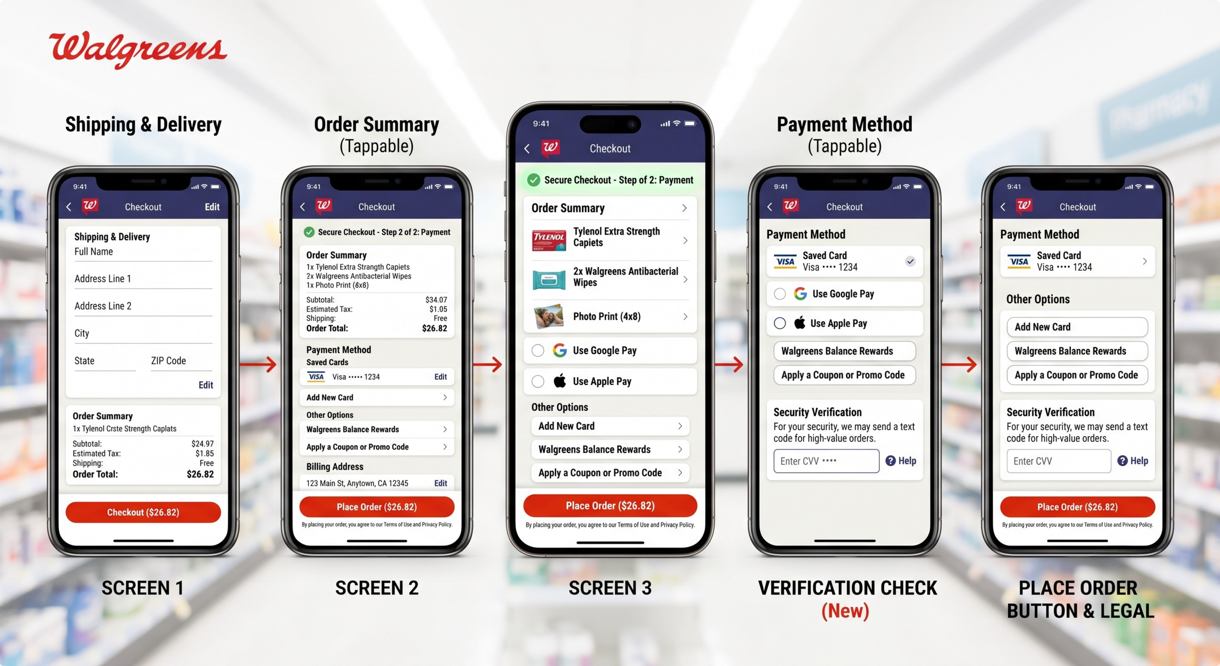
The Challenge: Walgreens faced a high drop-off rate on its mobile app and web platform during the prescription refill, payment and management process. Users found the interface cluttered, confusing, and stressful—especially when managing multiple medications or insurance transitions.
The Goal: Simplify the prescription management dashboard, reduce checkout friction for refills, and ensure the experience feels secure, accessible, and empathetic.
The Outcome: Redesigned the digital pharmacy portal and payment gateway screens with new user experience, resulting in a 24% increase in successful digital refills, a 15% reduction in pharmacy call-center volume, and a System Usability Scale (SUS) score jump from 58 to 82.
2. Research & Discovery
To design for healthcare, we had to look past standard retail behaviors. We conducted 12 deep-dive user interviews and ran a quantitative survey ($n=400$) across diverse age groups, focusing on individuals managing chronic conditions.
Key Insights & User Archetypes
The Overwhelmed Caregiver: Often managing prescriptions for multiple family members (kids and aging parents). Their biggest pain point was a lack of a unified dashboard to toggle between profiles.
The Tech-Hesitant Senior: Relies heavily on visual clarity, large hit targets, and step-by-step guidance. They frequently abandoned the app if "insurance errors" popped up without clear explanations.
The Friction Point: Users didn't understand the difference between "Processing," "Delayed," and "Ready for Pickup." Ambiguous status nomenclature caused panic and unneeded calls to the physical pharmacy.
3. Strategy & Information Architecture
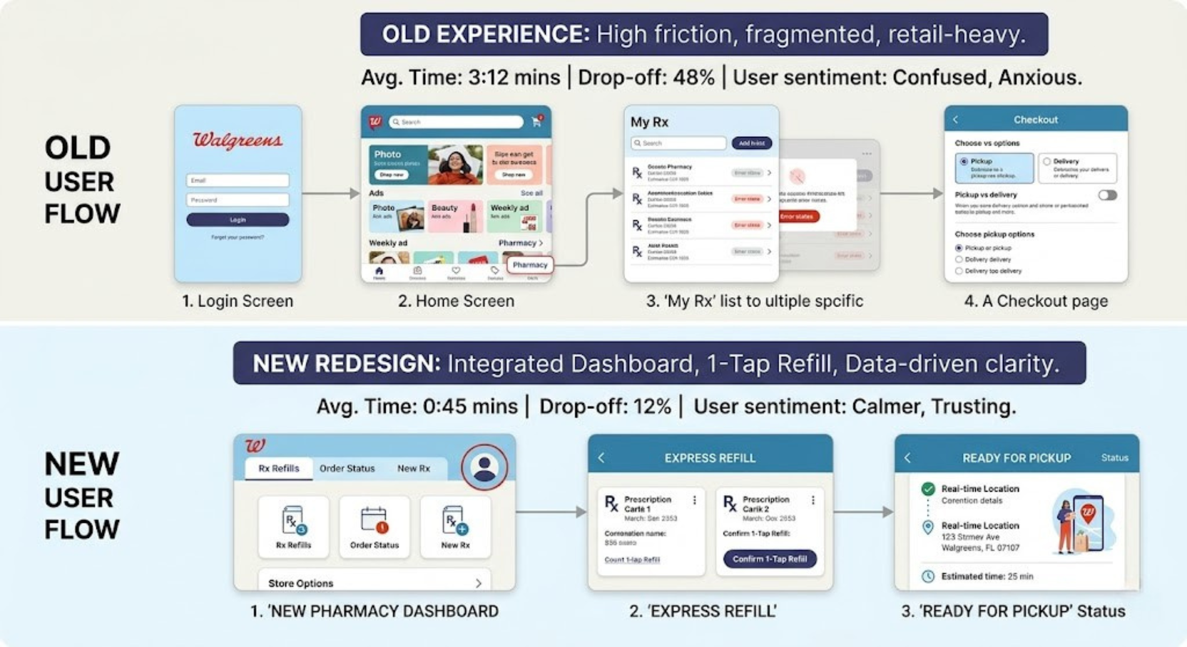
We mapped out the existing user flow and identified a massive bottleneck: users were forced to navigate through promotional retail offers (beauty products, photo printing) just to check on a critical medication status.
Design Principle: Healthcare First, Retail Second.
We established a strict structural boundary. When a user enters the "Pharmacy" tab, retail promotions are suppressed to reduce cognitive load and respect the user's emotional state.
The Redesigned User Flow
[Login / Biometric]
       │
       ▼
[Pharmacy Dashboard] ───► Action Required? (e.g., Fix Insurance) ───► High-Visibility Banner
       │
       ├─► Quick Refill (1-Tap for eligible scripts)
       └─► Switch Profiles (Caregiver mode)
4. Wireframing & Iterative Design
We ran rapid prototyping cycles, focusing heavily on accessibility (WCAG 2.1 AA compliance) given Walgreens' large senior demographic.
Dashboard Evolution
Old Experience New Redesign Cluttered Priority: Prescription list mixed with generic ads, coupons, and photo printing alerts.Strict Hierarchy: High-priority status cards at the top (e.g., "Ready for Pickup" or "Action Needed: Renew Rx").Ambiguous Copy: Statuses like "In Progress" left users guessing if they should drive to the store.Transparent Status: Micro-copy updated to: "We are verifying your insurance. Estimated ready time: 4:00 PM."Hidden Toggles: Caregivers had to go deep into account settings to view a dependent's profile.Persistent Switcher: A prominent avatar toggle at the top of the pharmacy screen to instantly switch accounts.
5. High-Fidelity UI & Design System Integration
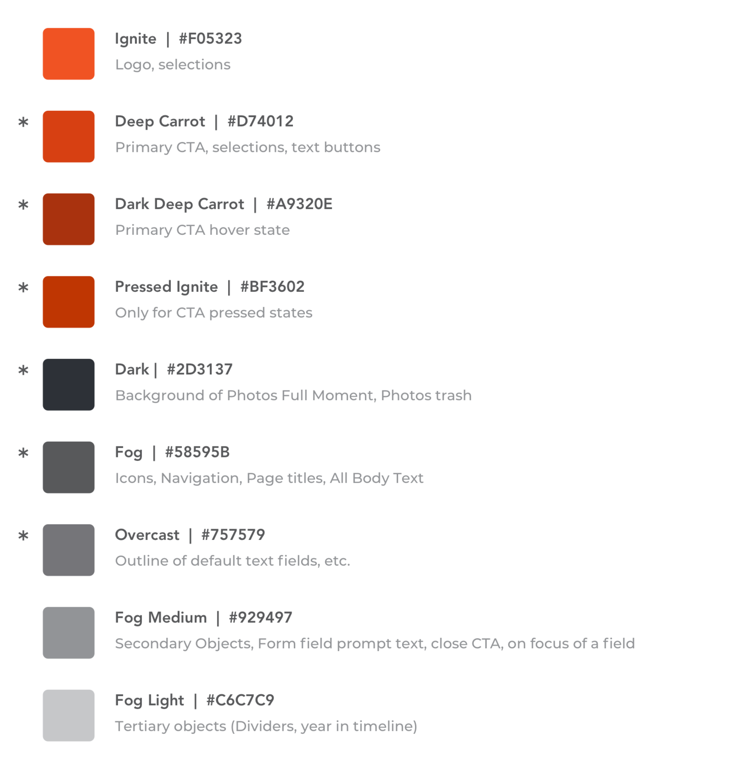
Working within Walgreens' existing brand guidelines, we expanded their digital design system to introduce cleaner data tables, more intuitive status icon iconography, and an empathetic color palette for alerts.
Color Psychology: Avoided harsh red alerts for non-critical insurance issues to reduce user anxiety. Instead, we utilized a warm amber for "action required" and a calm, crisp green for "ready."
Accessibility Enhancements: Ensured all text met a minimum 4.5:1 contrast ratio. Increased button touch-targets to a minimum of $48 \times 48\text{ dp}$ to accommodate users with tremors or low dexterity.
6. Testing & Validation
We ran unmoderated usability testing with 20 participants using our high-fidelity Figma prototype, specifically targeting users aged 50 and older.
Task Success Rate: Successfully navigating to a specific prescription and completing a refill went from 62% to 94%.
Time-on-Task: The average time to order a refill dropped from 3 minutes and 12 seconds to 45 seconds.
Qualitative Feedback:"It doesn't feel like it's trying to sell me something anymore. I can just get my heart medicine and close the app." — Participant 7
7. Impact & Key Takeaways
The redesign went live via an A/B test over a 6-week period before rolling out nationwide.
Business Metrics:+24% digital refill completion, shifting expensive phone-in and walk-in traffic to automated digital channels.
System Trust: App store ratings increased from 4.1 to 4.6 stars within three months of deployment, with reviews explicitly citing the cleaner pharmacy interface.
Key Learning: Designing for healthcare requires intense cross-functional collaboration. UX cannot operate in a vacuum; we had to work hand-in-hand with legal and compliance teams to ensure our simplified flows still met strict medical regulations without compromising the user experience.
Client: American Express
A few projects examples of the work that I led in the Cloud Engineering Platform .
Role - Lead User Experience Designer, American Express
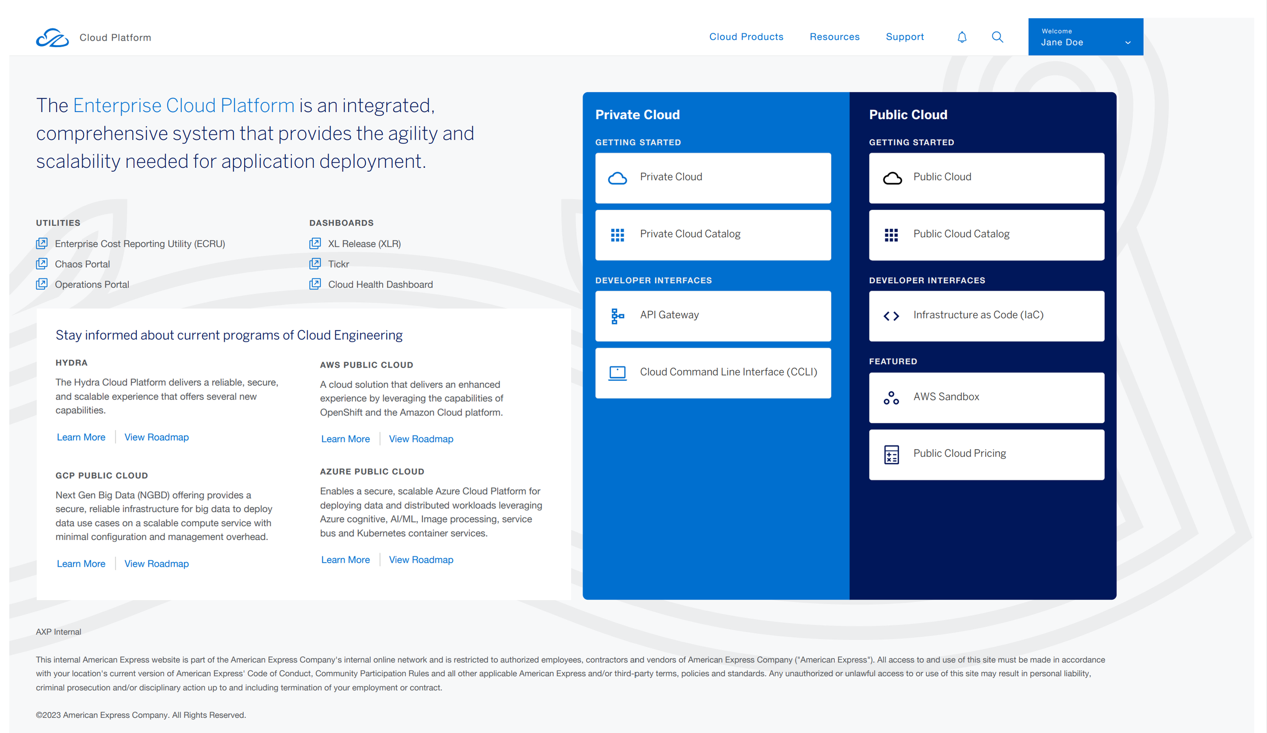
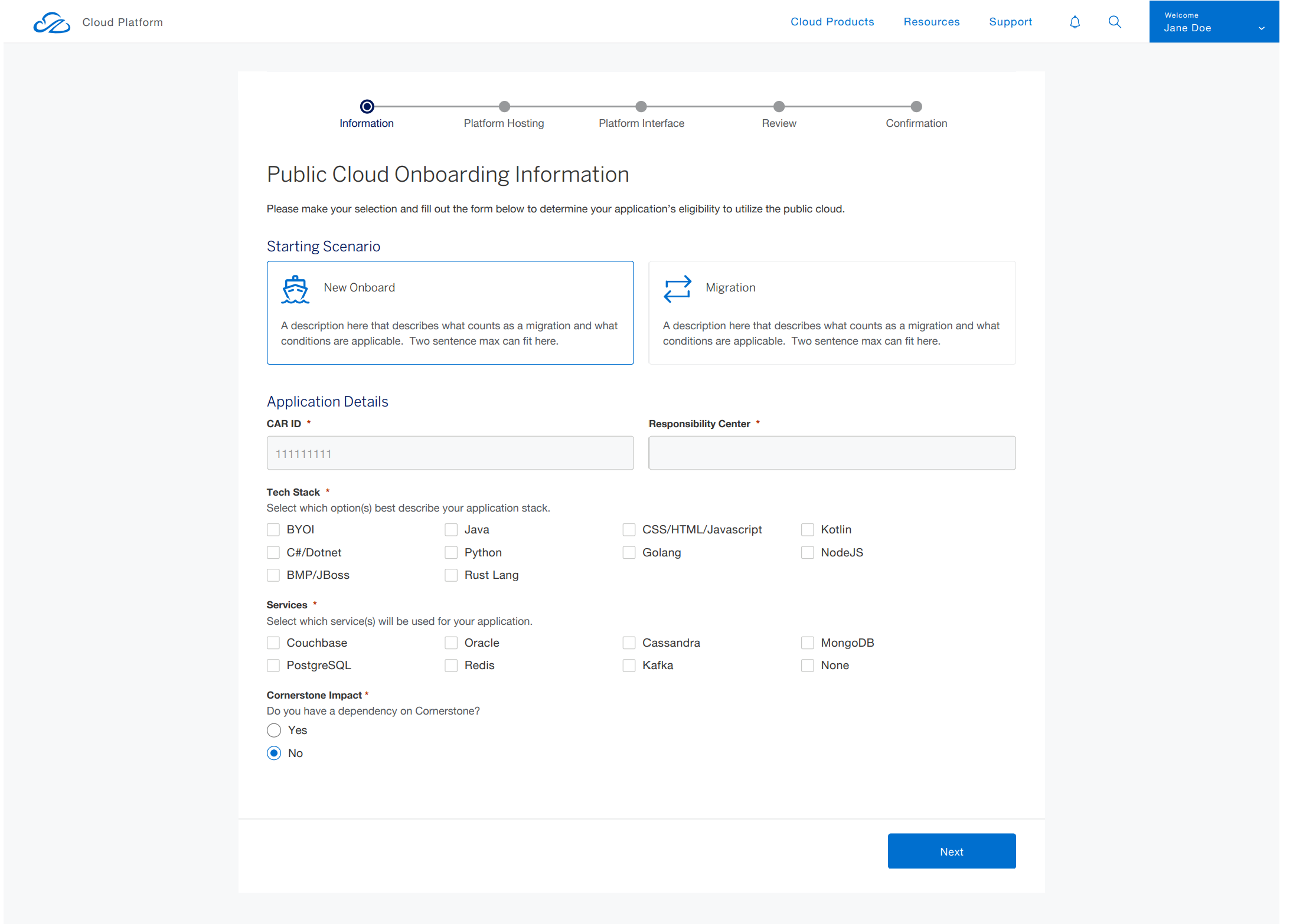
I joined American Express as a Senior UX designer and within two weeks of joining i was being assigned as a Lead UX designer leading 10 people who are Designers, Researchers, Developers and Testing Team in an Agile Environment. My work with American Express was a great adventurous where I was involved in the next generation Cloud based project - a one stop portal for the developers to choose the type of platform and deploy the application ether on the Private Cloud, Public Cloud or Hybrid Platforms, which have a wide variety options for the developers to customize and deploy the application.
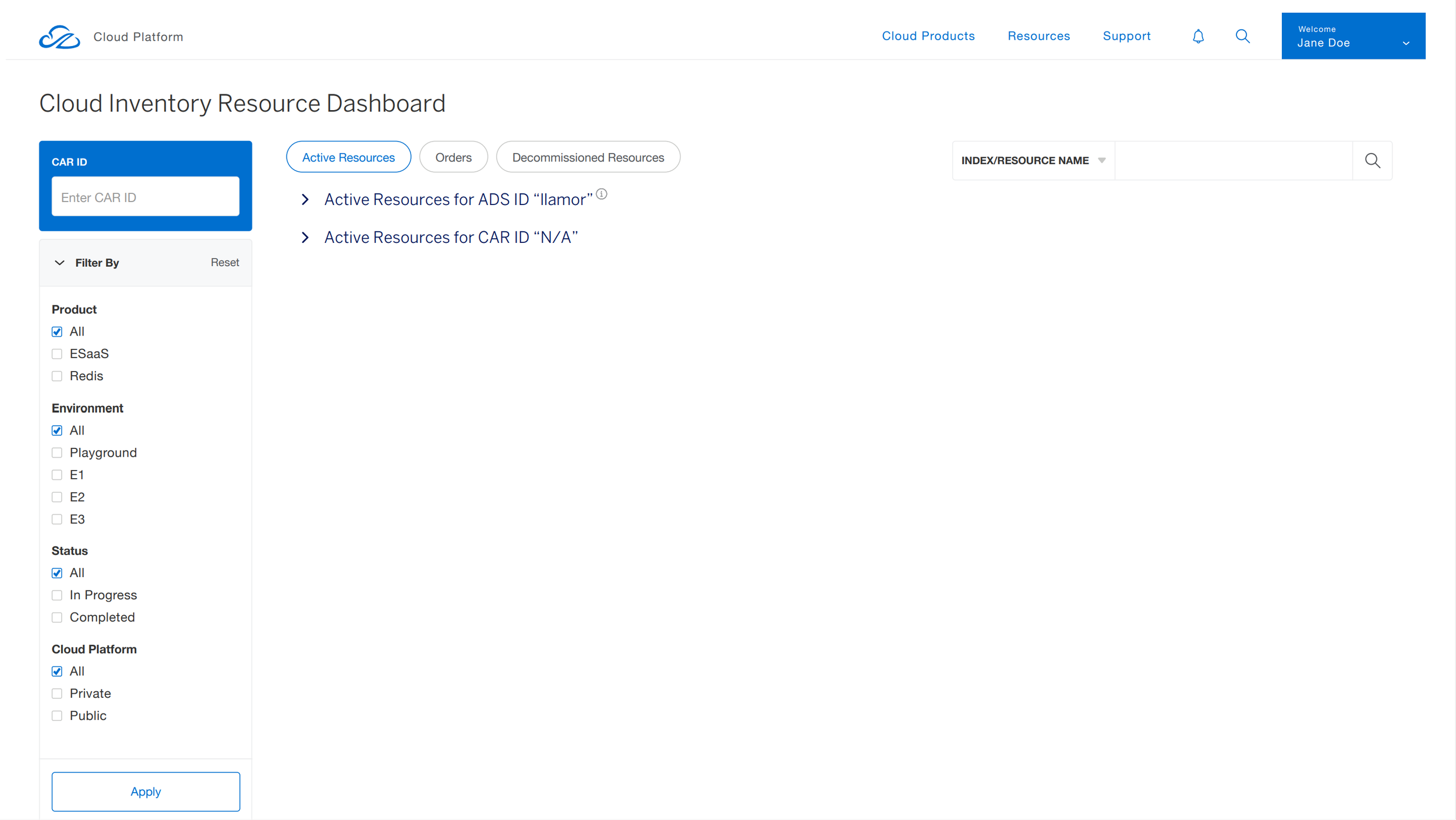
The second project was to build a dashboard to monitor the cloud hardware resources which includes the CPU Usage, Memory Usage and APIs status and health along with the issues in Slack and Jira related to the Cloud. My very initial understanding the concept and creation of wireframes had started almost after through studding the requirement and conducting the user research with various methods and techniques at a very high level and deeply understanding the gathered data. We hence used the gathered data mapped to the the requirement and build the information architecture. The entire process of building the portal and a dashboard had involved lot of effort in making it happen.
The initial iteration of the portal home page & dashboard that I designed had met the expectations of the product owner and other stake holders and was given appreciation. The feedback was provided at a very minimum level had helped me to deliver the work and move to further pages on portal. I had designed and contributed various graphical metrics and pie charts to the dashboard and added to the design system and react library as well for the developers. I had taken the initiative to recreate the logo of the all the Cloud Platforms.
Design layout of the Cloud Portal Final Release
Case Study
Project overview
When I was tasked with designing the cloud engineering portal for banking application, I knew it was crucial to make the experience seamless and secure for users across different regions. The original navigation structure was cluttered and inconsistent, causing frustration for the users trying to manage their deployments on the go. My goal was to create a streamlined, intuitive navigation system that would improve usability and build trust with users.
Timeline: 2 Years
Tools Used: Axure, Sketch, Illustrator, Miro
Objectives
Smart Global Navigation for Every Region
Develop a global navigation system that dynamically adapts to regional needs and regulations.
Clean and Tailored Experience for Every Segment
Personalize the user experience for different banking segments such as retail, corporate, and wealth management.
Consistent UI, Localized for Every Market
Maintain a consistent interface while accommodating local products and services.

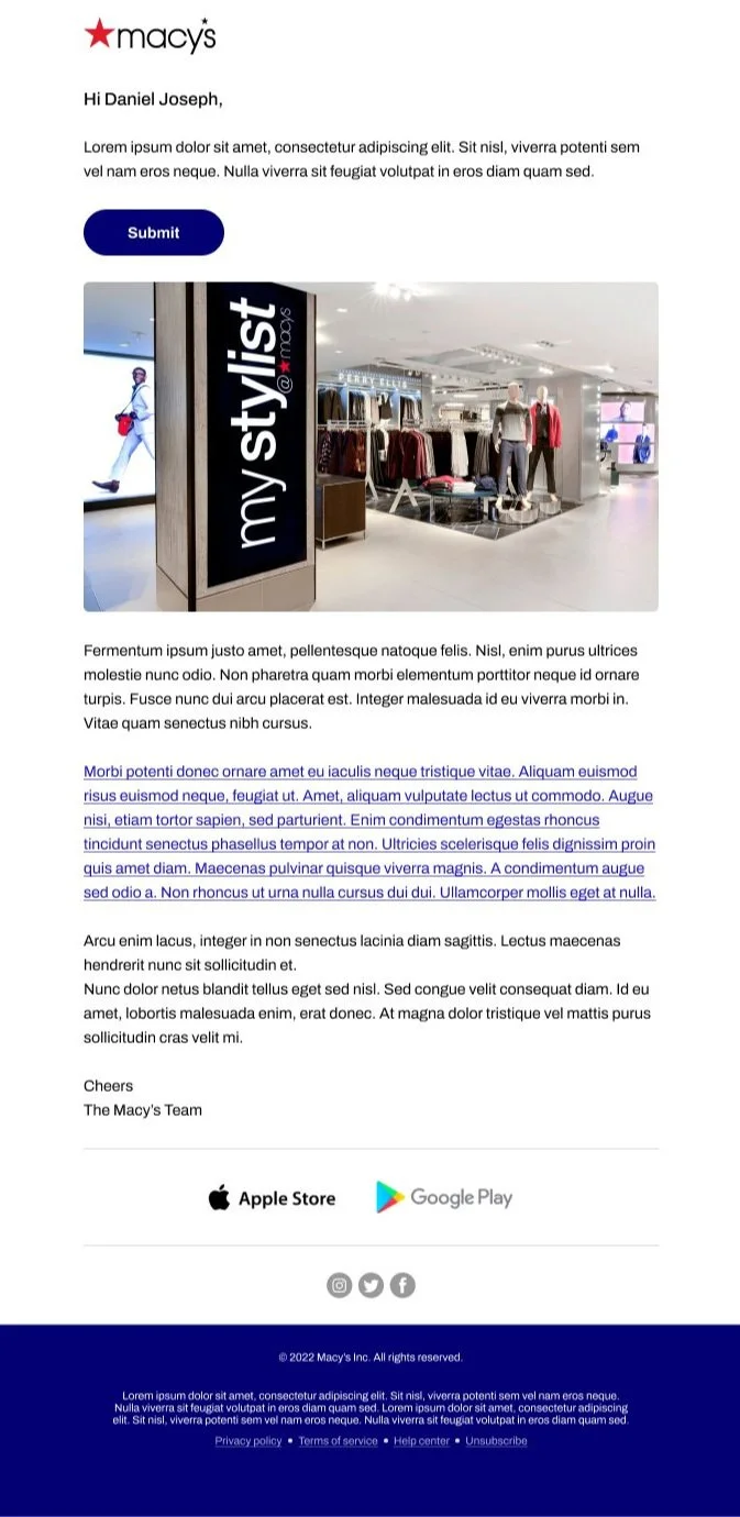
Email Design templates for mobile & Web based screens
Role - Lead UX/Content Designer, Macy’s
For Web - Layout - 1
For Mobile


For Web - Layout - 2
These projects are examples of mobile based Web design efforts that I led.
Role - Lead Designer, Shutterfly
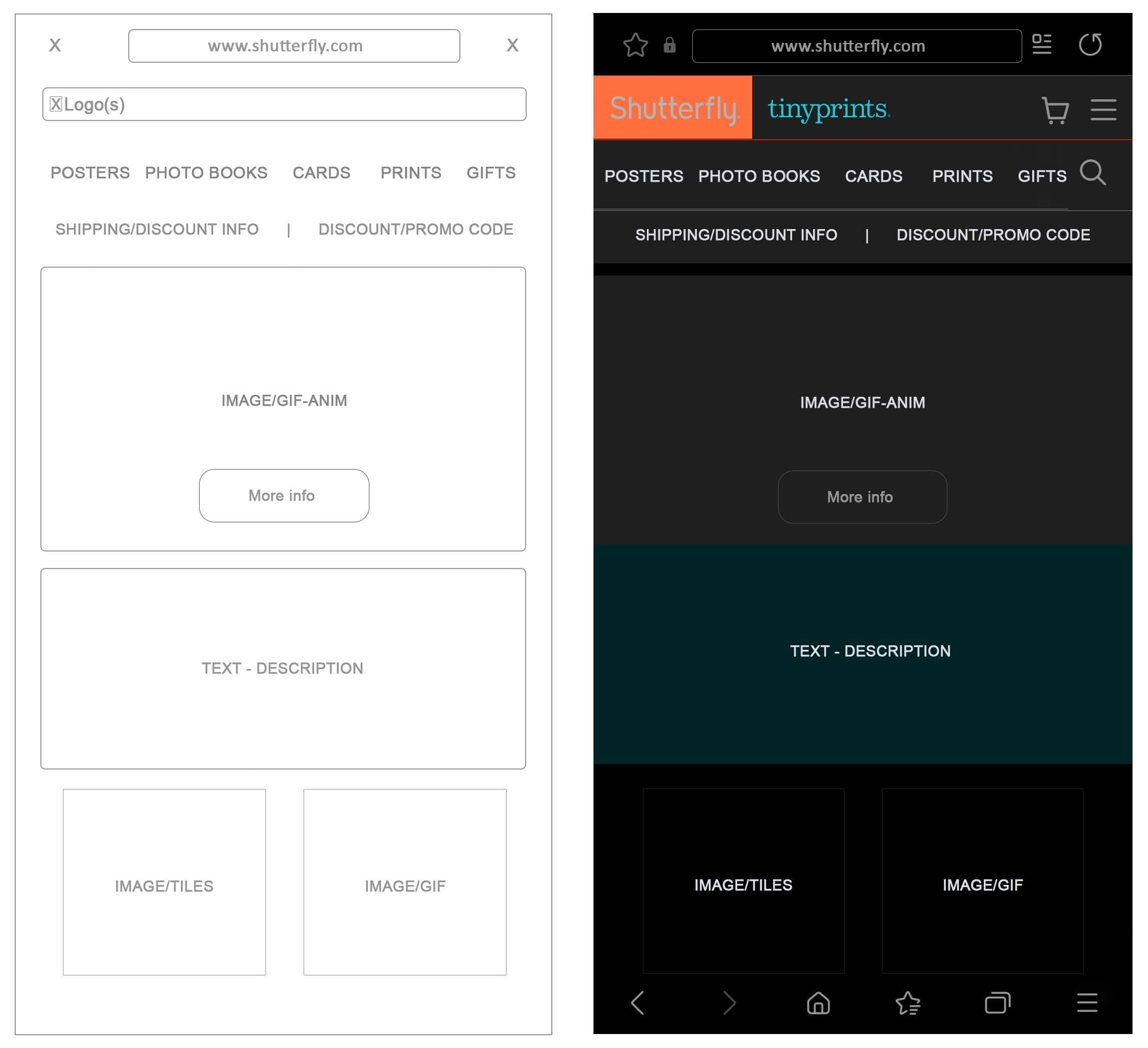
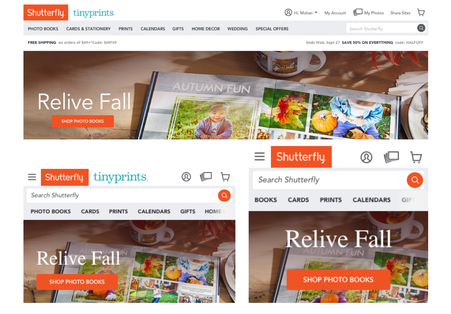
When I joined Shutterfly - a one stop print destination, which have extreme wide variety of products. In my initial journey at Shutterfly i noticed that the mobile webpage for the company is not responsive and not user friendly in any means. That led me to think about optimizing the pages along with re-design the entire layout starting with the landing page.
In the later months after we improvised the entire page, it had became my responsibility to completely overhaul their mobile page browsing experience. I worked closely with the PM, our researchers, customer support, and the core team to re-imagine the design experience.
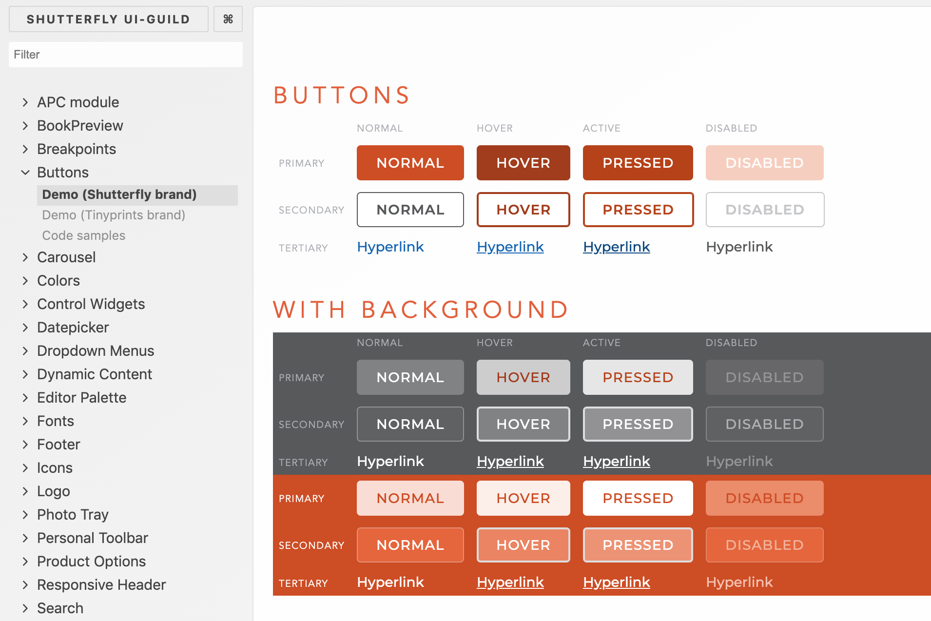
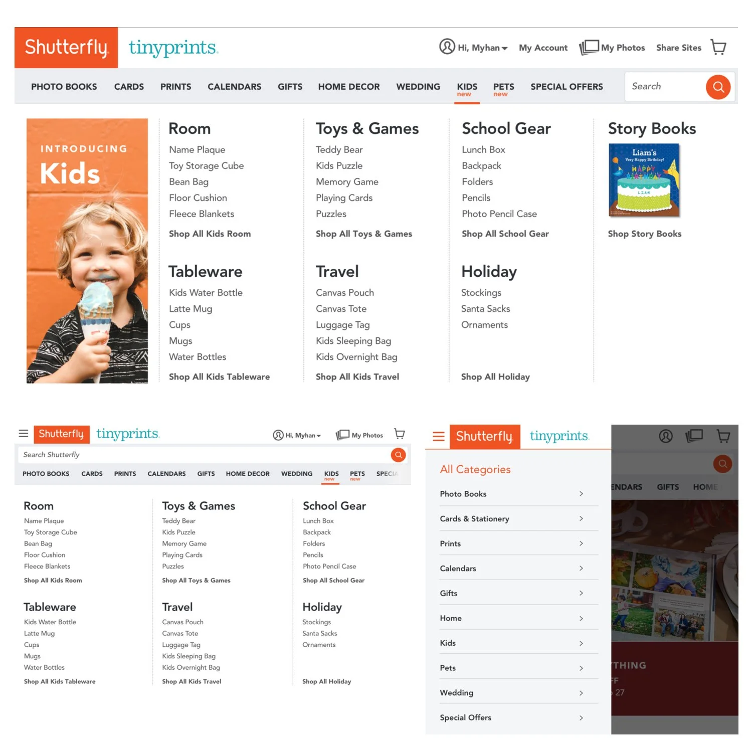
The re-design of the home page & all the landing pages had newly designed items:
Menus, Icons, sliders, Navigation panels
Drop down menus, CTA buttons, widgets
Search bar, Sign-in/Sign-up screen design, forms
I explored new metaphors for layout creation and style, colors, ultimately settling on simple model that resonated well with customers and fit with the business needs of establishing a lasting collection.
I shared wireframes and prototypes with customers and stakeholders as I iterated on the designs.
Working with marketing, we developed new brand guidelines, including new collectable monthly new special product, and I translated that into a UX style guide to introduce them on to the page.
I worked closely with the engineers, researchers and team throughout the design development process to address problems, answer questions, and ensure the product was built to specifications.
The resulting page was visited hundreds of thousands of times which had pushed up the business.
I was involved in completely reinventing the way people make products online. The Photobook.


Lead Designer - Shutterfly APP
As Web page developments wrapped up, I was tasked to bring the "best of breed" for photo books to the Shutterfly app.
Here I worked with a much larger team, stretching across three offices, to take all that I had learned about photo book creation and build a fully functional book editing tool that our advanced users wanted.
In the process, I helped architect an entirely new editing flow and navigation structure for the whole app. This book editing flow became the template for all flows within the app.
I led the effort to design, rethink the IA, test, iterate, and release an app that brought in hundreds of millions of dollars in revenue last year and nearly half of our new customer acquisition. It enjoys a 4.5 star rating on the Apple App Store.
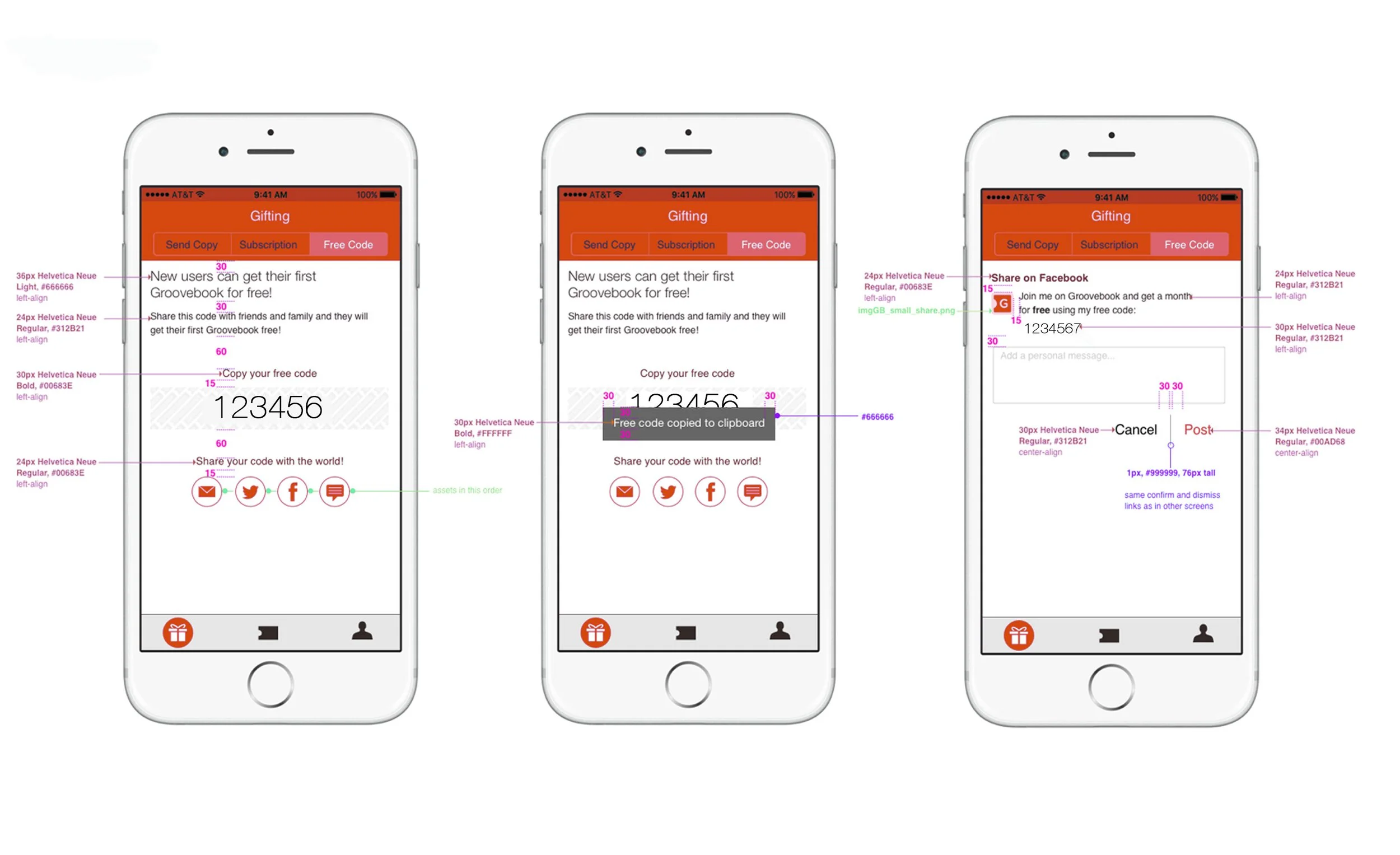


Team’s Idea to a Real APP
The story behind The TripPix project was to run as a start-up within Shutterfly. Our team of 10 had thought about an idea to build a platform where the customers could just get a printed book with all the pictures captured with the app. We worked to build an entirely new book creation experience from scratch. Our goal was to make an easy and fun travel book tailored specifically for millennials.
As the lead UX designer, I worked closely with the product and marketing managers to help craft the vision of the project. We conducted exploratory interviews, market research, and competitive research to shape the product.
Leading with 'blue sky' designs, I helped shape the product into a playful app for capturing pictures taken on the phone and, using metadata, automatically constructing a book about a recent trip.
I worked with marketing to develop a voice and brand identity for the app and translate that into the UX and packaging materials.
I built wireframes, ran in-person users tests, and worked with the development team to quickly iterate on design ideas.
Within eight months of kickoff, we built and launched a completely new app.
Our team was so successful that we were asked to replicate the process to develop other use-case focused, book creation apps.